Textiles & Bedroom Styling
Reading Texture: A Guide to Decorative Pillow Weaves and Visual Depth
A pillow can look like a quiet solid from across the room and reveal a whole new personality up close. Its weave shapes the way color catches light, the way a surface feels, and the way it sits beside sheets, blankets, and upholstery. Knowing what to look for makes it easier to layer texture with intention—without turning the bed into a busy patchwork.
Published October 12, 2026
Why a pillow’s weave changes the whole picture
Color gets plenty of attention when people choose decorative pillows, but the structure of the fabric can be just as influential. Weave determines how yarns cross, loop, or build up across a surface. That construction affects more than touch: it can make a color seem brighter or quieter, give a plain pillow a subtle pattern, and create shadow that shifts as daylight moves through the room.
Think of a pillow as a small patch of textile landscape. A smooth, tightly woven cover may read as crisp and tailored, while a raised or nubby one introduces a softer, more relaxed note. Put both on a bed and they do not compete simply because their colors differ. They also interact through sheen, relief, density, and the way each surface receives light.
This is the useful secret of visual depth: variation does not require a riot of prints. A restrained palette can still feel layered when its fabrics have different structures. Conversely, several pillows in distinct colors may look disconnected if their textures and patterns have no relationship to one another. The aim is not to collect every surface effect, but to choose a few that make sense together.
Start with the basic structures
Most pillow fabrics can be understood by noticing how their yarns or threads form a surface. You do not need a textile vocabulary test to make a good choice. A close look—and, when possible, a light touch—will tell you whether a cover is smooth, looped, ridged, patterned, or softly raised.
Plain weave: quiet, balanced, and adaptable
In a plain weave, horizontal and vertical yarns cross in a simple, regular sequence. The result is usually an even surface with a clear, understated appearance. Depending on the fiber, yarn size, and finishing, plain-woven cloth can feel crisp, soft, substantial, or airy. The structure itself is not a guarantee of a particular hand.
For styling, plain weave is a dependable visual pause. It can give a patterned duvet or highly textured blanket room to breathe. A solid-colored pillow in a plain weave is not necessarily flat or dull: tiny variations in yarn, a gentle natural slub, or a soft finish can lend the surface quiet character. Its strength is versatility. It tends to work as a steadying element among more expressive fabrics.
Twill: diagonal movement and subtle dimension
Twill is recognizable by diagonal lines formed as yarns pass over and under one another in a stepped pattern. The ridges may be delicate or pronounced, depending on the fabric. Even in a single color, those lines can create a soft sense of direction and depth. A pillow cover in twill may look more dimensional than a smooth, even weave without introducing a bold motif.
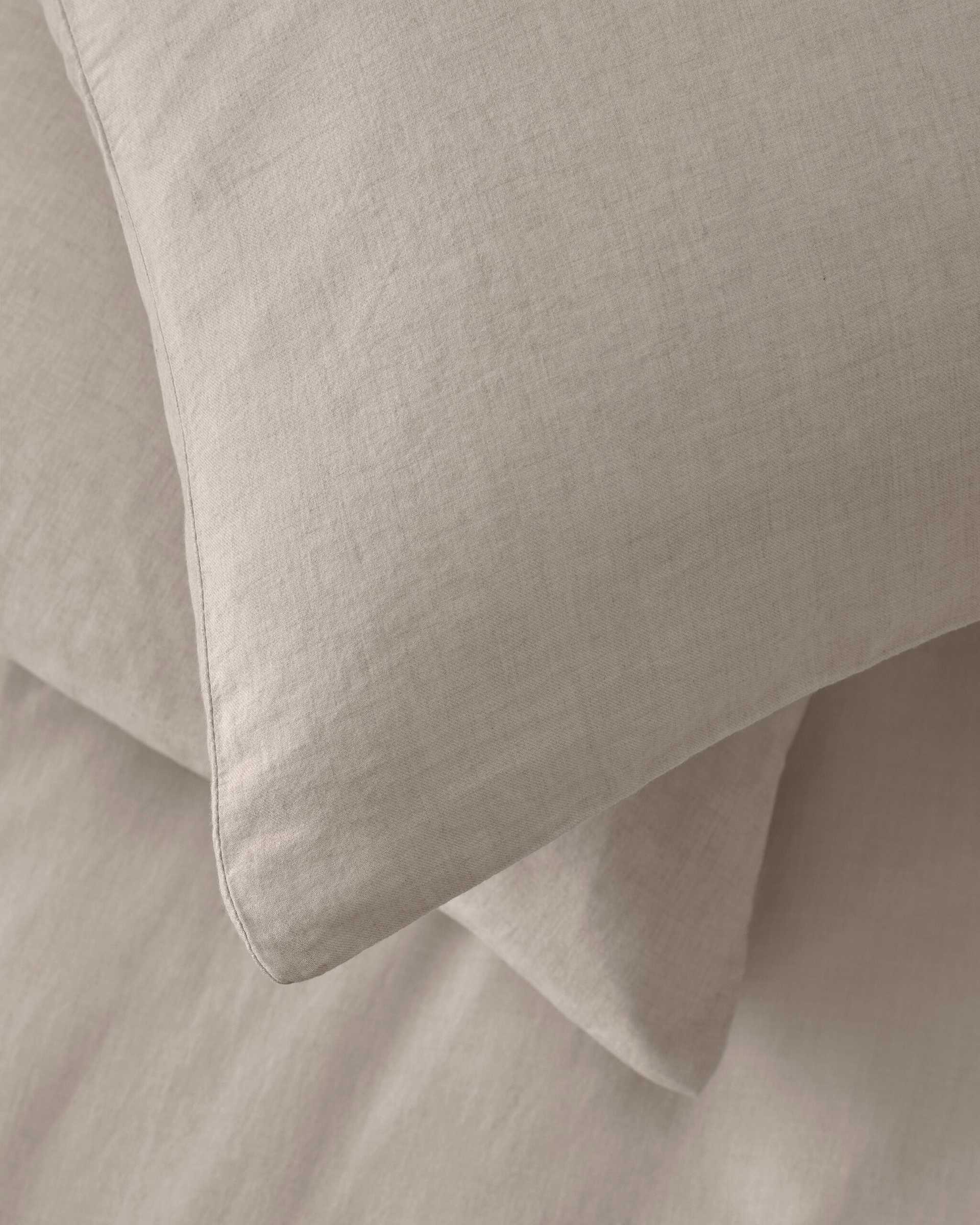
That makes twill especially useful when you want a tonal arrangement to feel considered rather than monotonous. A diagonal surface can complement straight-edged bedding, echo the lines of a headboard, or provide a slight change in rhythm next to a plain pillowcase. For example, Smir pillow cases use a diagonal weave in a cotton-and-cashmere blend. They are bed pillowcases rather than decorative cushion covers, but they offer a clear example of how a woven structure can add understated texture to a coordinated sleep setting.
Knit: loops, softness, and an easygoing feel
Knitted textiles are formed from interlocking loops rather than the crossing yarns of a woven fabric. Depending on the stitch, a knit can look fine and smooth, visibly ribbed, open and airy, or richly textured. The loops often create a softer, more flexible impression, making knit pillows a natural fit for relaxed bedrooms and layered lounge spaces.
Look closely at the stitch scale. A small, even stitch may blend easily into a refined scheme; a large or highly dimensional stitch can become a focal point. Knits can also introduce a pleasing contrast against crisp woven sheets. Because the fabric may stretch or respond differently to pressure, check how the cover is constructed and how it fits its insert. A textured face is lovely, but a tidy silhouette still matters.
Jacquard: pattern built into the fabric
Jacquard describes a method of weaving that can produce intricate patterns through the arrangement of yarns. Rather than simply printing a motif onto a finished surface, the design is created in the woven structure itself. Depending on the yarns and construction, the pattern may appear through changes in color, sheen, texture, or some combination of the three.
A jacquard pillow can feel richly detailed even when its palette is restrained. A low-contrast motif may emerge only when light grazes the fabric, while a stronger color contrast makes the design more immediately visible. This can be a useful middle ground between a plain solid and an all-over printed pattern. The design supplies interest, while the woven surface keeps it connected to the tactile character of the room.
Some jacquards have pronounced relief; others are comparatively flat. Do not assume that every woven motif will feel raised, or that a tactile surface must have a complicated pattern. If you are shopping in person, examine the front and back where possible. If you are choosing online, look for close-up descriptions of the construction rather than relying only on a room photograph.
Four details that help you compare texture
1. Surface relief
Relief is the degree to which a fabric’s surface rises or dips. A nearly smooth cover reflects light more evenly; a ridged, looped, or nubby one creates small areas of highlight and shade. Those tiny shifts give a solid color movement. Consider the other textiles nearby: if the duvet is already heavily quilted or the blanket has a pronounced stitch, a smoother pillow can provide balance. If the bed feels visually flat, a small amount of raised texture can enliven it.
2. Weave density
Density describes how closely the threads or yarns are packed. It influences the fabric’s appearance and feel, but it should not be treated as a stand-alone quality score. A dense cover may look compact and tailored; a looser structure can feel more open or casual. Fiber, yarn thickness, finishing, and intended use all matter. For a decorative pillow, think about the desired impression and how the cover will meet everyday life, not just the number of threads in a description.
3. Yarn contrast
Contrast can be created by different colors, different yarn thicknesses, or differences in sheen. When yarns are similar in tone, texture tends to be the main event. When light and dark yarns meet, the weave may produce a more visible pattern. A pillow can therefore look intricate without using a large range of colors—or bold without having a complicated structure. Decide which kind of attention you want it to draw.
4. Light and sheen
Light changes the way a textile reads. A matte, brushed surface tends to soften highlights, while smoother or more lustrous yarns can reflect them. Raised areas may catch light as their valleys fall into shadow. This is why a fabric that looks quiet in a product photograph may appear more animated in a bright bedroom, or why the same pillow can shift in character from morning to evening.
Whenever you can, consider the room’s natural and artificial lighting. A sample held beside the bed is more informative than a color viewed alone on a screen. Notice whether the textile looks warmer, cooler, brighter, or more subdued in its intended setting.
How to layer weaves without crowding the room
A cohesive arrangement usually needs a point of connection. That might be a shared color family, a repeated material, or a balance between smooth and textured surfaces. It does not mean every pillow has to match. In fact, thoughtful differences are what make layering feel personal. The trick is giving those differences a common thread.
Choose a palette, then vary the surface
Begin with two or three related colors: perhaps a light neutral, a deeper shade, and one quiet accent. Within that palette, let the weaves do some of the work. A plain-woven cover, a diagonal twill, and a small-scale jacquard can feel distinct without creating a color clash. Tonal styling is particularly effective this way because the changes in relief and light keep similar shades from disappearing into one another.
Mix scale, not just texture
Three pillows with equally bold, similarly sized textures may compete even when their colors coordinate. Instead, vary the scale: combine one more noticeable surface with a quieter weave and a smoother background. A large knit stitch can be balanced by a fine twill; a detailed jacquard may sit more comfortably beside an even plain weave than beside another elaborate motif.
Repeat one feature
Repetition helps a mix feel intentional. You might repeat a color in two different weaves, echo a diagonal line elsewhere in the room, or use related fibers across pillows and a throw. The repeated element acts like a friendly introduction between surfaces that might otherwise seem unrelated. It can be subtle: a shared warm undertone or similarly soft finish may be enough.
Leave room for a visual pause
Not every surface needs to make a statement. A smooth pillow or a simple solid cover can keep a layered bed from feeling overworked. Negative space matters in textiles just as it does in a room’s layout. When every piece has strong relief, shine, contrast, or pattern, the eye has nowhere to rest. A quieter fabric can make the special details stand out more clearly.
Texture has a color story, too
Weave and color are partners. A deep shade on a smooth surface may look sleek and uniform; the same shade on a textured fabric can appear shaded, softened, or gently variegated. Pale colors reveal shadows readily, so raised details can become especially noticeable. Mid-tones often offer a comfortable balance, showing texture without making every ridge the star of the bed.
When combining colors, pay attention to temperature as well as brightness. Creams, grays, and browns can have warm, cool, or neutral undertones. A difference in texture may help two related colors sit together, but it cannot always resolve undertones that visibly pull in opposite directions. Compare fabrics side by side in the room and look at them in more than one kind of light before settling on the mix.
Pattern also changes the way texture is perceived. A high-contrast motif can make a weave harder to notice from a distance, while a subtle pattern often allows the fabric’s relief to come forward. If you want a pillow to contribute both pattern and tactile interest, consider a design with restrained contrast. If texture is the priority, a solid or tonal cover gives the structure more space to speak.
A practical checklist before choosing a pillow
Looks matter, but the best decorative pillow is one that works in the room and suits the way you live. Before choosing, take a moment to consider these questions:
- What is already happening on the bed? Note the duvet pattern, sheet finish, blanket texture, and headboard surface. Choose a pillow that adds something new rather than repeating every feature.
- How much attention should it attract? A distinct jacquard or chunky knit may anchor the arrangement; a plain weave or fine twill can support it without competing.
- How will the fabric feel in use? If a pillow will be handled or leaned against, tactile comfort and the care instructions matter as much as its appearance.
- Does the cover suit its insert? The right fit helps a pillow look full and polished. Check sizing and construction rather than assuming every insert will behave the same way.
- Can the textile be maintained realistically? Review the care label. A delicate cover may be lovely, but it should suit the level of upkeep you are prepared to give it.
- Does it make sense in the room’s light? Consider the fabric beside the bedding at the time of day when the room is most often used.
These checks are especially helpful when buying online, where a carefully styled image can make texture difficult to judge. Product descriptions that identify a jacquard weave, knit construction, diagonal twill, or brushed finish give you more useful information than a vague promise of softness. Still, descriptions cannot fully convey handfeel, so samples or an easy return policy can be valuable when available.
Common styling missteps—and simple fixes
Making every pillow a feature. A dramatic motif, a chunky stitch, a shiny yarn, and a high-contrast stripe can all be appealing individually. Together, they may leave the bed without a clear focal point. Keep one or two expressive surfaces and let the rest provide support.
Confusing visual texture with softness. A fabric can look plush without feeling especially soft, and a smooth fabric may be comfortable against the skin. If touch is important, seek reliable material and care details rather than judging from appearance alone.
Choosing texture without considering wear. Some finishes can catch, flatten, or show handling more readily than others. Think about where the pillow will sit and how often it will be moved. A decorative accent on a rarely used bed has different demands from a cushion used every evening.
Pairing too many similar surfaces. Several fabrics with the same scale of relief can blur together. Introduce contrast through a smoother weave, a different stitch size, or a shift from matte to softly lustrous—while keeping the palette connected.
The finishing touch is restraint
Decorative pillows are small, but they can change the mood of an entire bedroom. A plain weave brings calm; a twill adds a gentle diagonal rhythm; a knit offers an easy, tactile note; and jacquard can make a pattern feel woven into the character of the room. Each structure offers a different way to work with color and light.
There is no single correct combination. Start with what the room needs: softness, definition, contrast, or a little more warmth. Then use texture to build that quality in measured steps. When the palette feels connected and the surfaces have room to be noticed, even a modest arrangement can look layered and inviting. The most successful pillow is not necessarily the most elaborate one. It is the one that makes the surrounding textiles feel more considered.