Introduction: Color as a Textile Language
Color is more than a surface treatment; it is a dialogue between light, pigment, and the tactile world of fabrics. When you study luxury bedding—think cashmere blends, organic cottons, silk shells, and refined wools—you’re not just choosing a hue. You’re selecting how warmth, texture, and drape will communicate in a sleep space. Across premium lines like Coyuchi and St Geneve, the most persuasive palettes emerge from understanding how fiber quality and weave influence color perception. Cashmere’s soft luster, for example, can make neutrals read warmer and more engery-rich than their synthetic counterparts. A pale taupe can glow with a silvery undertone when set against a smooth satin-sheened shell, while a charcoal weave may appear cooler on a breezy evening lamp.
This article takes a practical, editorial approach: we’ll build cohesive color palettes for bedding ensembles, outline swatch organization techniques, discuss lighting considerations, and explore care implications for color retention. We’ll also ground the discussion with case studies that reveal how real brands pair cashmere-inspired textures with deliberate color choices to craft serene, luxurious rooms.
Key Concepts: Color Theory Meets Textile Texture
- Color Temperature and Fiber Ambience: Warm fibers like cashmere and wool bring a natural warmth to color perception. In practice, warm neutrals (creams, oat, sand) paired with cashmere textures read as cozy and inviting, particularly in dim or amber-lit rooms.
- Chroma and Saturation in Textured Surfaces: Textured weaves and surfaces—seed stitches, eyelash fringes, jacquards—slightly mute or shift color perception. A rich espresso may read softer in a dense cashmere weave than in a smooth cotton satin, influencing palette decisions for blankets and pillows.
- Value Scales and Layering: Layering lighter and darker values creates depth in a bedding ensemble. A pale ivory duvet can be anchored by charcoal throws and graphite decorative pillows to prevent the palette from feeling flat.
- Swatch Organization as Palette Architecture: Swatches function as a map: organize swatches by hue families (neutrals, warm ambers, cool charcoals), then by warmth (warmth vs. coolness), and finally by material family (cashmere, cotton, silk, wool).
Palette-Building: Practical Steps for Cohesion
A thoughtful bedding palette begins with three anchor colors, each rooted in the texture of the textiles you intend to showcase. Consider a cashmere-inspired neutral, a complementary accent color, and a grounding dark. The following steps offer a practical workflow, informed by real-world product lines.
- Define the Anchor Neutral: Start with a cashmere-inspired neutral such as a soft ivory, warm beige, or light taupe. This anchor should harmonize with natural light in the room and the overall mood you wish to evoke (calm, luxurious, or softly modern).
- Choose a Complementary Accent: Select a color that adds depth without competing with the anchor. For cashmere aesthetics, consider muted amber, clay, moss, or sea-grass tones. These hues pair beautifully with cashmere textures and organic cottons.
- Add a Dark Ground: Introduce a charcoal, slaty, or deep taupe to ground the palette. A dark shade stabilizes the softness of cashmere-inspired neutrals and helps lift lighter accents.
- Texture as a Color Modifier: Consider the interplay of textiles—cashmere blankets, knit pillows, and silk shells—and how they shift color perception. The same neutral can feel warmer or cooler depending on weave density and fiber.
- Lighting Considerations: Lighting governs how color reads. Warm incandescent or amber-tinted light enhances the warmth of neutrals, while cooler daylight or LED lights can reveal the elegance of cooler neutrals within cashmere textures.
Case Studies: Real-World Cashmere Palettes
To illustrate how the theory translates into living spaces, we examine palette pairings drawn from brand collections that emphasize texture, hue, and sustainable luxury.
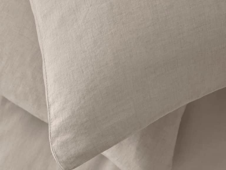
Case Study 1: Coyuchi-Inspired Calm — A layered neutral scheme built around a Cashmere-tinged ivory duvet cover with a soft taupe throw and a knitted pillow in a slightly warmer shade. The subtle variance in fibers (cashmere blend vs. organic cotton) creates depth, while lighting optimizes the warmth.
The palette leans into a serene, spa-like mood that feels premium yet approachable—perfect for modern bedrooms that prize comfort and quiet luxury.
Case Study 2: Charcoal and Cashmere — A cooler palette anchored by a charcoal duvet with cashmere-tinged accents, such as pale ivory pillows and a soft, open-weave throw in a lighter gray. This pairing creates a refined, nocturnal mood suitable for minimalist or contemporary spaces.
The dark ground provides contrast while preserving the tactile softness essential to a cashmere-inspired aesthetic.
Case Study 3: Warm Amber Accents — Neutral base with amber accents in decorative pillows and a cashmere-soft blanket. Lighting in warm tones enhances the amber notes, creating a cozy, inviting retreat.
This palette embraces warmth without overpowering the quiet luxury of cashmere textures.
Three Time-Period Voices: Designers and Historians
In this segment, we spotlight three influential figures across different eras who shaped how color and textiles are perceived, valued, and used in interiors and fashion.
1) Edith Head (1907–1981): The Studio Color Language
Though primarily recognized as a Hollywood costume designer, Edith Head’s careful approach to color in fabric and silhouette informs modern bedding palettes. Head’s philosophy—color as a mood shaper and character cue—translates to bedding where neutral grounds can be elevated with subtle color cues in textiles. Her era established a discipline of coordinating fabrics with lighting and space, a principle still central to color theory in luxury textiles today.
2) Ray Eames (1903–1978): Texture as Perception
The Eames era celebrated honest materials and expressive textures. In bedding, texture becomes a color interpreter. The weave, nap, or fuzz of a cashmere blend shifts the surface’s luminance, altering how a color reads under different lights. Eames’s design ethos—functions gracefully, looks refined—parallels the approach to color and fiber in premium bedding, where texture and color work as a duo rather than separate elements.
3) Iris Apfel (born 1921): Boldness in Subtlety
Iris Apfel’s unapologetic love of texture and unexpected color pairings resonates in modern cashmere palettes. Her philosophy encourages designers to mix neutrals with gentle pops of color—an approach ideal for decorative pillows, throws, and bedding sets that nod to cashmere luxury without shouting.
Leveraging Real-World Products: A Palette in Practice
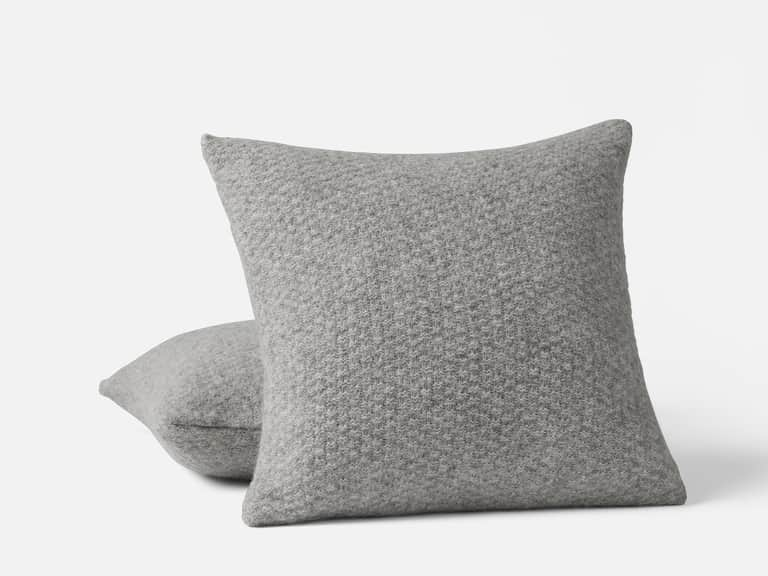
Translating theory into tangible design often starts with curated products. From the provided catalog, the Smir Pillow Cases Set (Society Limonta) demonstrates how a diagonal weave of cotton and cashmere adds warmth and durability to a neutral palette. The Cordillera Alpaca Cotton Knit Decorative Pillow from Coyuchi offers a plush seeded texture that subtly shifts perception of color, especially in layered ensembles. And the Cirrus Supersoft Organic Cotton Throws (Germany-Turkey supply chain) show how brushed, heavyweight textures can anchor palettes while adding tactile depth.
These pieces are not just accessories; they are color accelerators. The diagonal weave of Smir pillow cases creates tonal variations that allow neutrals to move toward warmer or cooler readings depending on lighting. Cordillera’s alpaca-cotton knit pillow cover introduces a soft, tactile warmth that makes a pale ivory or linen base feel more immersive. Cirrus throws bring a calm intensity to any palette—soft, breathable, and machine-washable for everyday luxury.
Smir Pillow Cases Set
Cotton and cashmere blend in a diagonal weave; two cases per set; machine washable.
Price: 315.00
View ProductCordillera Alpaca Cotton Knit Decorative Pillow
56% alpaca, 44% pima cotton; seed stitch; invisible zipper; Peruvian weaving.
Price: 148.00
View ProductPutting It All Together: A Designer’s Workflow
The endgame is a bedroom that feels curated, calm, and unmistakably luxurious. Here is a practical workflow that mirrors editorial strategies used by premium bedding brands:
- Mood Board Creation: Start with a cashmere-inspired neutral as your anchor, then attach a secondary warm or cool accent depending on the room’s natural light. Include fabric swatches, fiber descriptions, and lighting sketches to visualize color shifts at different times of day.
- Swatch Management: Create a swatch log that tracks hue, value, fiber, and weave. For each swatch, note how lighting changes its appearance—this helps preempt hue drift in final textiles and décor.
- Texture-Driven Color Layering: Pair textiles with distinct textures—flat weaves, seed stitches, and knits—to create depth and subtle tonal variation within the same color family.
- Light Planning: Plan for multiple lighting layers—ambient, task, and accent lighting—to modulate the perceived color palette across mood settings (morning, afternoon, evening).
- Care and Longevity: Consider care requirements that impact color retention. For example, dry-clean or hand-wash durable cashmere blends; machine washable organic cotton throws for convenience, and color-safe detergents to preserve hue integrity over time.
Conclusion: The Quiet Luxury of Cashmere-Inspired Palettes
Color theory, when married to the tactile language of textiles, creates more than a decorative scheme—it crafts an atmosphere. A cashmere-inspired palette speaks of softness, warmth, and understated elegance. It invites you to embrace serenity, to layer textures thoughtfully, and to curate a sleeping space that feels both luxurious and lived-in. By combining grounded palettes with texture-rich fabrics and careful lighting, designers can achieve a refined, timeless aesthetic that remains fashionable across seasons.
If you’d like, I can draft a sample site map (pages and content topics) and a content calendar to kick off the Color & Textile Education Hub concept, focusing on color theory, textile science, and care guides designed for designers, students, and enthusiasts.